Designing Trust: Behind Nearville’s New Identity

Redesigning Nearville taught us that brand identity is much more than visuals. It is about trust, emotion, and how people feel the moment they land in your product.
Startups are wild. One minute you’re designing a button, the next minute you’re leading a whole rebrand.
But the surprising part?
I ended up enjoying the chaos because every messy step taught me something real.
Somewhere in that swirl of roles, I realized that building a brand isn’t just about visuals.
It’s about shaping how people feel when they use your product, trust your community, and decide to come back.
And that’s exactly what we focused on with Nearville’s new identity, not just “looking better,” but solving the emotional barriers students shared with us.
Talking with our potential users made it clear:
They want a platform that feels trustworthy, warm, and welcoming at first glance.
That insight became the anchor for every design decision we made.
1. Tone, Trust, and Safety
Nearville only works when people trust the community.
So we built a visual language that feels warm, human, and safe.
Nielsen Norman Group’s Aesthetic Usability Effect still rings true for me; good visuals build trust, especially when someone is deciding whether to borrow something from a stranger.
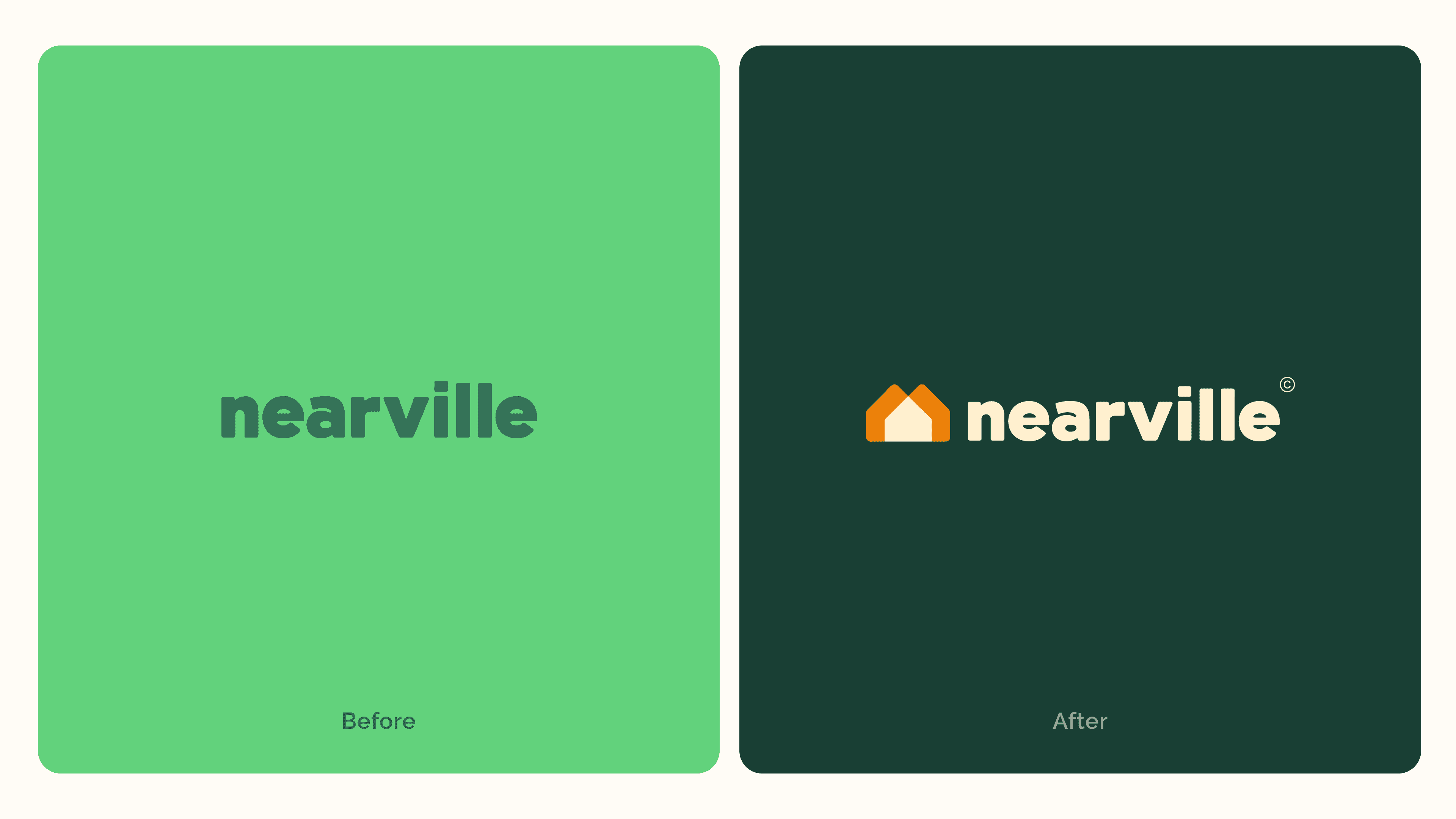
2. Color
The old bright green felt young, but not very grounded.
Students told us they wanted something calmer and more “real.”
So we moved toward warmer, more mature tones that reflect the kind of community we’re building safe, inviting, and dependable.
3. Logo
We used to only have a logotype.
Now we have a symbol that actually captures our name:
Two houses overlapping to create a shared home, a simple metaphor for what happens when neighbors connect.
Recap
As the founding product designer, guiding this new visual direction felt natural and meaningful. I don’t have a long history in brand design, but the Form class I took at CCA honestly carried me through, and believing in Nearville made the work even easier.
This whole process reminded me of something important:
You don’t have to be perfect to keep moving forward.
I’m learning to grow little by little, even while figuring things out along the way.
In a startup, doing your best with the time you have is a skill in itself.
Someone once said, “If you’re not embarrassed by your first version, you launched too late.”
I think about that often. A reminder that progress matters more than perfection.
There’s still a long road ahead, but I’m excited to keep building and even more excited to see how this new identity grows with our community.
As we keep refining the product, I’ve been thinking a lot about how early design choices can quietly shape trust.
In your experience, what subtle design changes in early-stage products have made the biggest difference in building user trust quickly?
#productdesign #branding #startupdesign #uxdesign #figuringout